

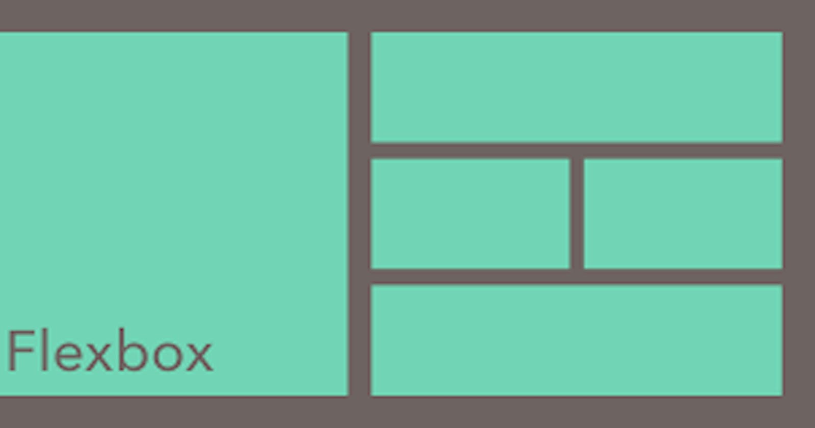


What is Flexbox?
Flexboxis a layout model that allows elements to align and distribute space within a container. Using flexible widths and heights, elements can be aligned to fill a space or distribute space between elements, which makes it a great tool to use for responsive design systems.The Axes of Flexbox
For flex-direction : row
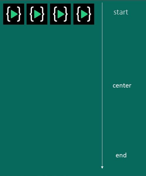
Main-axis: X-axisCross-axis: Y-axisFor flex-direction : column
Main-axis: Y-axisCross-axis: X-axisExample :
<body>
    <div class="container">

        <div class="hi">
            <img src="lco.png" alt="">
        </div>
        <div class="hi">
            <img src="lco.png" alt="">
        </div>
        <div class="hi">
            <img src="lco.png" alt="">
        </div>
        <div class="hi">
            <img src="lco.png" alt="">
        </div>

    </div>
</body>
style.css
.container {

}
Output

Flex-direction
- row
- row-reverse
- column
- column-reverse
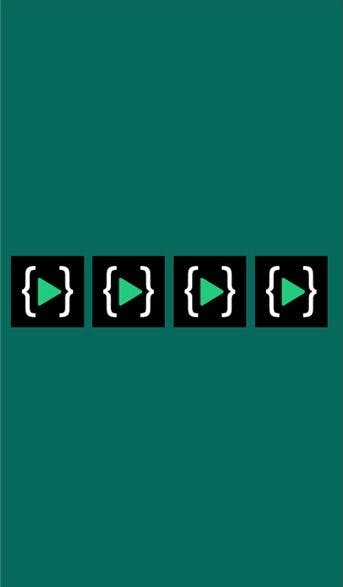
row
.container {
display: flex;
flex-direction: row;
}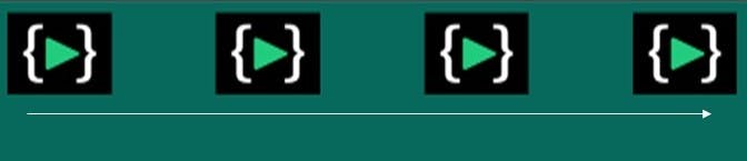
row-reverse
.container {
display: flex;
flex-direction: row-reverse;
}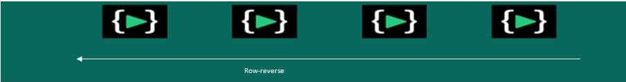
column
.container {
display: flex;
flex-direction: column;
}
column-reverse
.container {
display: flex;
flex-direction: column-reverse;
}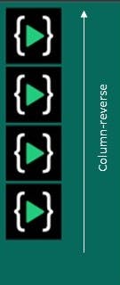
Justify-content
The justify-content property aligns the flexible container's items when the items do not use all available space on the main axis (horizontally). Its value is as follow:
- center
- flex-start
- flex-end
- space-between
- space-around
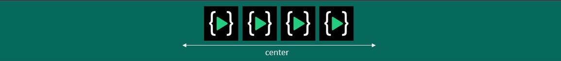
center: items will be positioned in the center of the container
.container {
  display: flex;
  justify-content: center;
}
flex-start: items are positioned at the beginning of the container. (Default value)
.container {
  display: flex;
  justify-content: flex-start;
}

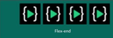
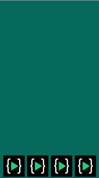
flex-end: items are positioned at the end of the container.
.container {
  display: flex;
  justify-content: flex-end;
}
space-between: items will have space between them.
.container {
  display: flex;
  justify-content: space-between;
}

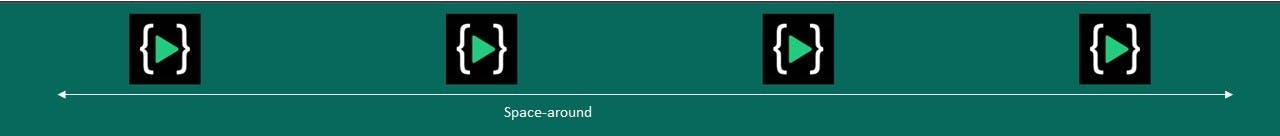
space-around: items will have space before, between, and after them.
.container {
  display: flex;
  justify-content: space-around;
}
Using justify-content we are aligning the item on the main axis.
Align-items
align-itemcontrols the alignment of an item on the cross axis this property is set directly to the child in the group. Its value is as follows:
- flex-start
- flex-end
- center
flex-start- items will be positioned at the beginning of the container.
.container {
    display: flex;
    align-items: flex-start;
}
center- items are positioned at the center of the container.
.container {
    display: flex;
    align-items: center;
    height: 100vh;
}
flex-end- items are positioned at the end of the container.
.container {
    display: flex;
    align-items: flex-end
    height: 100vh;
}
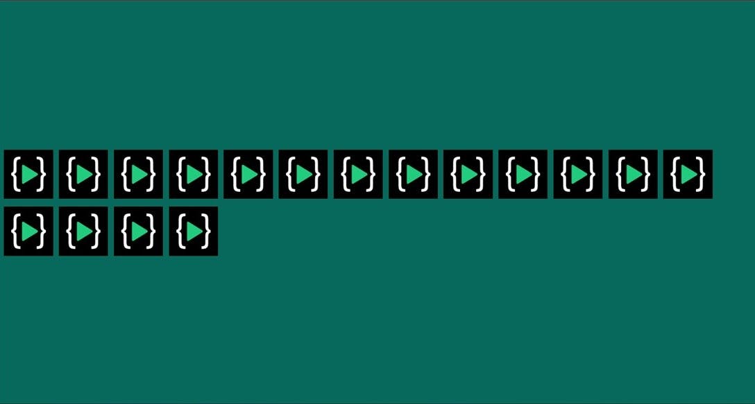
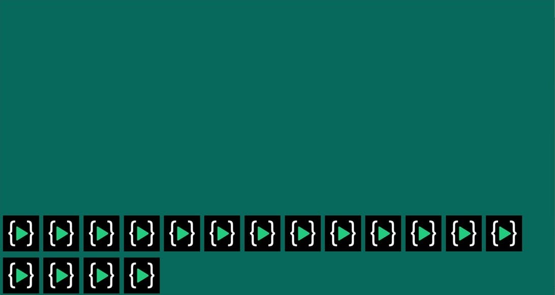
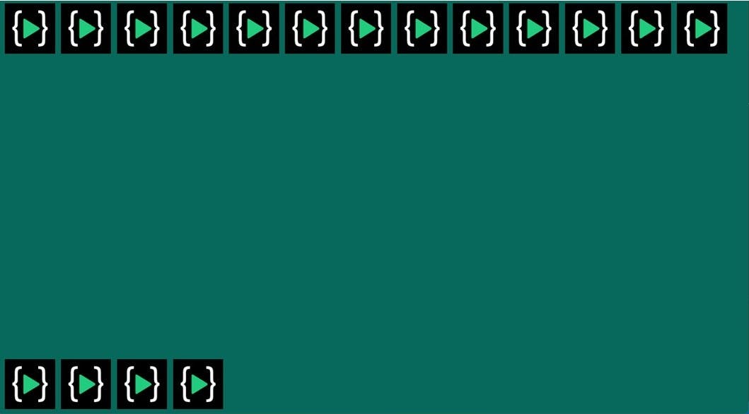
Flex-wrap
The flex-wrap CSS property sets whether flex items are forced onto one line or can wrap onto multiple lines. If wrapping is allowed, it sets the direction in that lines are stacked.
- nowrap
- wrap
- wrap-reverse
nowrap- The flex items are laid out in a single line which may cause the flex container to overflow.
.container {
    display: flex;
    flex-wrap: nowrap;
}

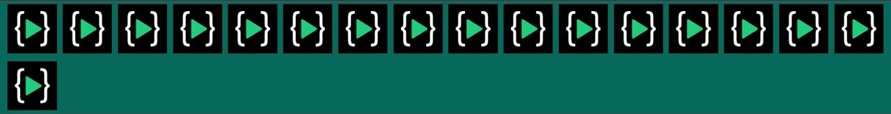
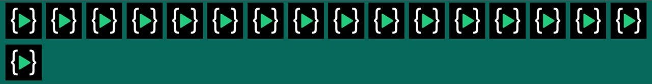
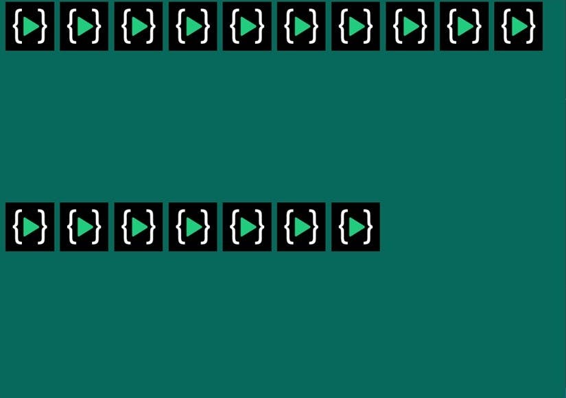
wrap- The flex items break into multiple lines.
.container {
    display: flex;
    flex-wrap: wrap;
}
wrap-reverse- Behaves the same as a wrap but cross-start and cross-end are permuted.
.container {
    display: flex;
    flex-wrap: wrap-reverse;
}

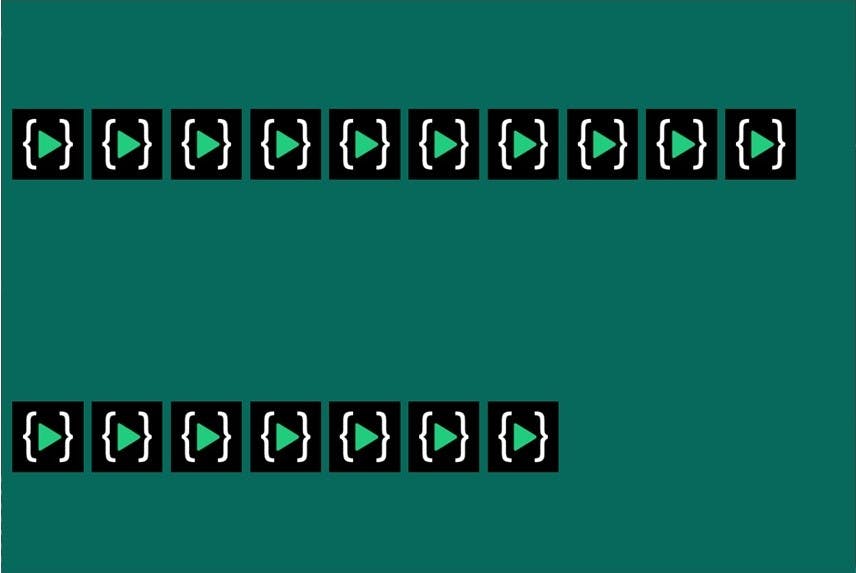
Align-content
The align-content property modifies the behavior of the flex-wrap property. It is similar to align-items, but instead of aligning flex items, it aligns flex lines.
- flex-start
- center
- flex-end
- space-between
flex-start- Lines are packed toward the start of the flex container.
.container{
    display: flex ;
    flex-wrap: wrap ;
    align-content : flex-start;
    height: 100vh;
}
center- Lines are packed toward the start of the flex container.
.container{
    display: flex ;
    flex-wrap: wrap ;
    align-content : center;
    height: 100vh;
}
flex-end- Lines are packed toward the end of the flex container.
.container{
    display: flex ;
    flex-wrap: wrap ;
    align-content : center;
    height: 100vh;
}
space-between- Lines are evenly distributed in the flex container.
.container{
    display: flex ;
    flex-wrap: wrap ;
    align-content : space-between;
    height: 100vh;
}
space-around- Lines are evenly distributed in the flex container, with half-size spaces on either end.
.container{
    display: flex ;
    flex-wrap: wrap ;
    align-content : space-around;
    height: 100vh;
}
stretch- Default value. Lines stretch to take up the remaining space.
.container{
    display: flex ;
    flex-wrap: wrap ;
    align-content : stretch;
    height: 100vh;
}
This is not the end of flexbox. If you want to know more about flexbox you can visit